
Google's Mobile-Friendly Update: What You Need To Know
In this article, we will explore Google's Mobile-Friendly Update and its impact on websites.
We will answer common questions such as what the update is, how Google determines if a website is mobile-friendly, and the consequences for websites that are not mobile-friendly.
We will also provide tips for improving the mobile-friendliness of a website and discuss the importance of mobile-friendliness for ranking well in Google search results.
As the use of mobile devices to access the internet continues to grow, it is becoming increasingly important for websites to be mobile-friendly. In an effort to provide a better user experience for mobile users, Google introduced the Mobile-Friendly Update in 2015.
This update is designed to improve the ranking of mobile-friendly pages in Google search results.
In this article, we will delve into the details of the Mobile-Friendly Update and its implications for website owners and developers.
What Is Google's Mobile-Friendly Update And Why Was It Introduced?
Google's Mobile-Friendly Update, also known as "Mobilegeddon," was a change to the search algorithm that Google introduced in April 2015.
The update was designed to give a boost in search rankings to websites that are optimized for mobile devices, and to penalize those that are not.
This update was significant because it marked the first time that Google had made mobile-friendliness a ranking factor in its search algorithm.
At the time, the use of mobile devices to access the internet was on the rise, and Google recognized that it was important to ensure that its search results were relevant and useful for mobile users. By prioritizing mobile-friendly websites in its search results, Google aimed to improve the user experience for people accessing the internet on their phones and tablets.
The Mobile-Friendly Update was a major change for website owners, as it meant that they had to ensure that their websites were optimized for mobile devices in order to maintain their search rankings. This included making sure that the website was responsive, meaning that it would automatically adjust to fit the screen size of the device it was being viewed on. It also meant that websites had to be easy to navigate on a small screen, with buttons and links that were easy to tap with a finger.
In order to determine whether a website was mobile-friendly, Google used a tool called the "Mobile-Friendly Test." Website owners could use this tool to see if their site was optimized for mobile devices, and to get recommendations on how to improve it if it was not.
The Mobile-Friendly Update was introduced in order to improve the user experience for mobile users and to ensure that they were able to easily access the information they needed when searching on their phones or tablets. With the increasing use of mobile devices to access the internet, it was important for Google to make sure that its search results were relevant and useful for mobile users. By prioritizing mobile-friendly websites in its search results, Google was able to improve the user experience for millions of people around the world.
How Does Google Determine If A Website Is Mobile-Friendly?
Google uses a number of factors to determine if a website is mobile-friendly.
These factors include the layout and design of the website, the ease of use and navigation, and the loading speed of the website on mobile devices.
One key factor that Google looks at is the layout of the website. A mobile-friendly website should have a layout that is easy to read and navigate on a small screen. This means that the text should be large enough to read without zooming, and the buttons and links should be easy to tap. Google also looks for websites that use responsive design, which means that the layout adjusts automatically to fit the screen size of the device being used.
Another factor that Google considers is the ease of use and navigation of the website. A mobile-friendly website should be easy for users to navigate and find the information they are looking for. This means that the website should have a clear hierarchy and navigation structure, with links and buttons that are easy to tap and follow. Google also looks for websites that have a search function that is optimized for mobile devices, so users can easily find what they are looking for.
The loading speed of the website is also an important factor for Google. Mobile users expect websites to load quickly, and Google takes this into account when ranking websites in search results. A slow-loading website can be frustrating for users, and may result in a high bounce rate, which is when users leave the website quickly after arriving. To improve the loading speed of a website on mobile devices, it is important to optimize images and other media files, as well as to minimize the use of large or unnecessary scripts and code.
In addition to these factors, Google also looks at the use of mobile-specific tags and the presence of a mobile version of the website. Mobile-specific tags, such as the "viewport" tag, tell Google how the website should be displayed on mobile devices. A separate mobile version of the website, with a separate URL, can also be an indication to Google that the website is mobile-friendly.
Overall, Google uses a combination of these factors to determine if a website is mobile-friendly. By making sure that a website is easy to read and navigate on a small screen, loads quickly, and has a clear hierarchy and navigation structure, website owners can improve their chances of ranking well in Google search results on mobile devices.
What Are The Consequences For A Website That Is Not Mobile-Friendly?
In today's world, where smartphones and tablets have become ubiquitous, it is essential for websites to be mobile-friendly. A mobile-friendly website is one that is designed specifically for viewing on small screens, such as those of smartphones and tablets.
It is optimized for easy navigation, fast loading times, and a seamless user experience.
The consequences for a website that is not mobile-friendly can be significant and far-reaching.
Here are some of the most significant consequences:
- Poor user experience: One of the most immediate and noticeable consequences of a website that is not mobile-friendly is that it can be difficult or even impossible to use on a small screen. This can lead to frustration and disappointment among users, who may simply abandon the website in favor of a more user-friendly alternative.
- Lower search rankings: Google has made it clear that mobile-friendliness is a key ranking factor in its search algorithms. This means that websites that are not mobile-friendly are likely to rank lower in search results, making it harder for users to find them.
- Decreased traffic and engagement: If a website is not mobile-friendly, it is likely to receive less traffic and engagement from users accessing it on mobile devices. This can have a knock-on effect on overall traffic and engagement, as mobile users are increasingly becoming the majority of web users.
- Reduced revenue: If a website is not mobile-friendly, it is likely to see a reduction in revenue. This can be due to a number of factors, including lower traffic, lower conversion rates, and reduced customer loyalty.
- Decreased brand credibility: A website that is not mobile-friendly can damage the credibility of a brand. This is because it suggests that the company does not prioritize the needs of its mobile users, and may even be seen as out-of-touch with modern trends and technologies.
- Loss of potential customers: If a website is not mobile-friendly, it is likely to lose potential customers to competitors who have invested in mobile-friendly websites. This can have a significant impact on the company's bottom line, as these customers may never return.
- Negative reviews and feedback: If a website is not mobile-friendly, users may leave negative reviews and feedback, which can damage the reputation of the company. This can lead to a decline in customer loyalty and brand credibility, as well as a reduction in revenue.
In conclusion, the consequences for a website that is not mobile-friendly can be significant and far-reaching. From a poor user experience and lower search rankings to reduced revenue and decreased brand credibility, the impact can be felt across a range of areas. It is therefore essential for companies to invest in mobile-friendly websites to ensure that they are able to reach and engage their mobile users effectively.
How Can I Test If My Website Is Mobile-Friendly?
There are several ways to test if your website is mobile-friendly, which is essential for the success of any business in today's digital age. With the increasing use of smartphones and tablets, it is crucial to ensure that your website is optimized for mobile devices.
Here are some ways to test if your website is mobile-friendly:
- Use Google's Mobile-Friendly Test tool: Google's Mobile-Friendly Test tool is a free and easy-to-use tool that allows you to check if your website is mobile-friendly. Simply enter your website's URL and click on the "Test" button to get a report on the mobile-friendliness of your website. The report will provide information on the loading speed of your website, the presence of any mobile usability issues, and whether your website passes Google's mobile-friendly test.
- Test your website on different devices: Another way to test the mobile-friendliness of your website is by visiting it on different devices such as smartphones, tablets, and laptops. This will allow you to see how your website looks and functions on different screen sizes and resolutions.
- Use mobile emulator tools: Mobile emulator tools allow you to test how your website looks and functions on different mobile devices without having to physically access them. Some popular mobile emulator tools include BrowserStack and MobileTest.me.
- Check your website's responsive design: Responsive design is a design technique that ensures that your website adjusts to the screen size of the device it is being viewed on. To test if your website has a responsive design, you can use the Chrome browser's "Inspect" feature. Simply right-click on your website and select "Inspect," then click on the "Toggle Device Toolbar" icon to see how your website looks on different devices.
- Check for mobile-specific errors: Mobile-specific errors can impact the performance and usability of your website on mobile devices. To check for these errors, you can use tools like W3C's Mobile Checker and Mobile Friendly Test. These tools will identify any mobile-specific errors, such as the use of Flash, the presence of pop-ups, and the use of fixed-width images, which can hinder the performance of your website on mobile devices.
- Check your website's loading speed: The loading speed of your website is crucial for its success on mobile devices, as users are often on the go and have limited patience. To test your website's loading speed on mobile devices, you can use tools like Google's PageSpeed Insights and GTmetrix. These tools will provide a report on the loading speed of your website and provide recommendations on how to improve it.
- Check for mobile-specific SEO issues: Mobile-specific SEO issues can impact the visibility of your website on mobile search engines. To check for these issues, you can use tools like the Mobile-Friendly Test and the Mobile Usability report in Google Search Console. These tools will identify any mobile-specific SEO issues and provide recommendations on how to fix them.
In conclusion, testing the mobile-friendliness of your website is crucial for the success of your business in today's digital age. By using tools like Google's Mobile-Friendly Test, mobile emulator tools, and mobile-specific SEO tools, you can ensure that your website is optimized for mobile devices and provides a seamless user experience for your mobile visitors.
How Can I Improve The Mobile-Friendliness Of My Website?
Improving the mobile-friendliness of a website is essential in today's digital age, as more and more people are using their smartphones and tablets to browse the web. In fact, Google has stated that mobile-friendliness is a ranking factor in its search algorithm, so having a mobile-friendly website can have a positive impact on your search engine rankings.
Here are some tips on how to improve the mobile-friendliness of your website:
- Use responsive design: A responsive website is one that adjusts to the device it is being viewed on, whether it is a desktop computer, tablet, or smartphone. This means that the website layout, images, and text will automatically adjust to fit the screen size of the device. To create a responsive website, you can use a responsive framework such as Bootstrap or Foundation, or you can use media queries in your CSS to specify different styles for different screen sizes.
- Optimize images: Large images can take longer to load on mobile devices, which can affect the overall speed of your website. To improve the mobile-friendliness of your website, you should optimize your images by reducing their file size without sacrificing quality. You can use tools like Photoshop or GIMP to resize and save your images for the web, or you can use online tools such as TinyPNG or Kraken to compress your images.
- Use a mobile-friendly navigation menu: A navigation menu that is easy to use on a desktop may not be as easy to use on a mobile device. To improve the mobile-friendliness of your website, you should use a navigation menu that is easy to use on a mobile device. This can include using a hamburger menu, which is a three-line icon that opens a dropdown menu when clicked, or using a sticky menu that stays at the top of the screen as the user scrolls down the page.
- Avoid using Flash: Flash is a technology that is not supported on many mobile devices, so using it on your website can make it difficult for mobile users to access your content. Instead, you should use HTML5 and CSS to create interactive elements on your website.
- Test your website on different devices: It's important to test your website on different devices to ensure that it is mobile-friendly. You can use tools such as Google's Mobile-Friendly Test or Adobe's Mobile Emulation to see how your website looks on different devices. You can also use a service like BrowserStack to test your website on real devices.
- Use a mobile-friendly font: Not all fonts are easy to read on small screens, so it's important to choose a font that is easy to read on mobile devices. Some fonts that are good for mobile devices include Arial, Verdana, and Georgia.
- Use a mobile-friendly layout: A layout that works well on a desktop may not work as well on a mobile device. To improve the mobile-friendliness of your website, you should use a layout that is easy to read on a mobile device. This can include using a single-column layout, using larger font sizes, and avoiding large blocks of text.
- Optimize your website for touch screens: Many mobile devices use touch screens, so it's important to optimize your website for touch. This can include using larger buttons that are easy to tap with a finger, and avoiding elements that are too close together.
- Use a mobile-friendly content management system: If you use a content management system (CMS) to manage your website, make sure that it is mobile-friendly. Some CMS platforms, such as WordPress, have mobile-friendly themes that you can use to create a mobile-friendly website
- Use Google's Accelerated Mobile Pages (AMP): AMP is a project by Google that aims to improve the loading speed of web pages on mobile devices. By using AMP, you can create lightweight versions of your web pages that load faster on mobile devices. To implement AMP on your website, you will need to create AMP versions of your web pages and link them to your regular web pages.
- Use lazy loading: Lazy loading is a technique that loads content on a web page as the user scrolls down the page. This can help improve the loading speed of your website on mobile devices, as it reduces the amount of content that needs to be loaded at once. To implement lazy loading on your website, you can use a library such as Lazy Load or jQuery Lazy.
- Optimize your website for Google's mobile-first index: Google's mobile-first index means that it uses the mobile version of your website to determine its ranking in search results. This means that it is important to ensure that your mobile website is up-to-date and contains all of the same content as your desktop website.
In summary, there are many ways to improve the mobile-friendliness of your website. By using responsive design, optimizing images, using a mobile-friendly navigation menu, avoiding Flash, and testing your website on different devices, you can create a website that is easy to use and accessible on mobile devices. Additionally, using a mobile-friendly font, layout, and content management system, and implementing AMP and lazy loading can also help improve the mobile-friendliness of your website. Lastly, optimizing your website for Google's mobile-first index is essential to ensure that your website ranks well in search results.
Is It Necessary For My Website To Be Mobile-Friendly To Rank Well In Google Search Results?
In today's digital age, it is crucial for a website to be mobile-friendly in order to rank well in Google search results.
With the increasing use of smartphones and tablets for browsing the internet, it is important for businesses to ensure that their website is accessible and user-friendly on these devices.
Google has recognized the importance of mobile-friendliness and has made it a ranking factor in its search algorithm. This means that if a website is not mobile-friendly, it may rank lower in search results, leading to less visibility and potentially less traffic. On the other hand, a mobile-friendly website will have an advantage in ranking, potentially leading to more visibility and traffic.
So what makes a website mobile-friendly? There are several factors to consider when designing a mobile-friendly website. One important factor is the layout and design of the website. A mobile-friendly website should have a responsive design, which means that it adjusts to the size of the device it is being viewed on. This means that the layout should be easy to read and navigate on a small screen, with elements such as buttons and links being easy to tap with a finger.
Another factor to consider is the loading speed of the website. Mobile users are often on the go and do not have the patience to wait for a slow-loading website. Google has stated that faster loading times can improve a website's ranking, so it is important to optimize the loading speed of a mobile-friendly website. This can be achieved through techniques such as compressing images and minimizing the use of large files.
In addition to the layout and loading speed, the content of the website should also be optimized for mobile. This includes using larger text and fonts that are easy to read on a small screen, as well as making sure that the content is organized in a logical and easy-to-follow manner.
It is also important to consider the user experience when designing a mobile-friendly website. This includes making sure that the website is easy to navigate and that the user can easily find the information they are looking for. This can be achieved through the use of clear headings and subheadings, as well as a clear hierarchy of information.
In conclusion, it is necessary for a website to be mobile-friendly in order to rank well in Google search results. With the increasing use of smartphones and tablets for browsing the internet, it is important for businesses to ensure that their website is accessible and user-friendly on these devices. Google has recognized the importance of mobile-friendliness and has made it a ranking factor in its search algorithm, meaning that a mobile-friendly website will have an advantage in ranking, potentially leading to more visibility and traffic. Factors such as the layout, loading speed, and content of the website should be optimized for mobile in order to provide a good user experience and improve ranking.
How Does The Mobile-Friendly Update Affect My Website's Ranking In Google Search Results?
In 2015, Google released the Mobile-Friendly Update, also known as "Mobilegeddon," which aimed to improve the mobile search experience for users by prioritizing mobile-friendly websites in search results.
This update has had a significant impact on the ranking of websites in Google search results, as more and more users are accessing the internet from their smartphones and tablets.
Before the Mobile-Friendly Update, Google used a number of different factors to determine the ranking of a website in search results, including the relevance and quality of the content, the number of backlinks, and the overall user experience. While mobile-friendliness was always a factor, it was not given as much weight as it is today.
With the Mobile-Friendly Update, Google began to prioritize websites that are optimized for mobile devices in search results. This means that if your website is not mobile-friendly, it may be ranked lower in search results compared to websites that are optimized for mobile devices.
There are several ways to make your website mobile-friendly, including using responsive design, which allows the website to automatically adjust to different screen sizes and resolutions, or using a separate mobile version of the website.
To determine if your website is mobile-friendly, you can use Google's Mobile-Friendly Test tool, which will give you a report on the mobile-friendliness of your website. This report will provide information on any issues that may be impacting the mobile-friendliness of your website, such as text that is too small to read on a mobile device or links that are too close together.
If your website is not mobile-friendly, it is important to take steps to improve the mobile experience for your users. This may involve redesigning your website to be more responsive, or creating a separate mobile version of the website.
In addition to improving the ranking of your website in search results, making your website mobile-friendly has a number of other benefits. Mobile users are more likely to stay on your website longer and engage with your content if they have a positive mobile experience, which can lead to increased traffic and conversions.
Mobile-friendliness is also becoming increasingly important for businesses, as more and more consumers are using their smartphones to search for products and services. If your website is not mobile-friendly, you may be missing out on potential customers.
Overall, the Mobile-Friendly Update has had a significant impact on the ranking of websites in Google search results. If your website is not mobile-friendly, it is important to take steps to improve the mobile experience for your users in order to improve your ranking in search results and attract more traffic and conversions.
Can I Be Exempt From The Mobile-Friendly Update?
As the world becomes increasingly reliant on mobile devices for online browsing, search engines like Google have made it a priority to ensure that websites are mobile-friendly. In 2015, Google released the Mobile-Friendly Update, which gives a ranking boost to websites that are optimized for mobile viewing.
This update has had a significant impact on search results, with many websites seeing a drop in ranking if they are not mobile-friendly.
But can you be exempt from the Mobile-Friendly Update? The short answer is no, all websites are subject to this update. However, there are a few exceptions that may apply to your situation.
First, it’s important to understand that the Mobile-Friendly Update only affects mobile search results. If a website is mobile-friendly, it will rank higher in mobile search results, but this does not necessarily affect its ranking in desktop search results. So, if your website is primarily geared towards desktop users, the Mobile-Friendly Update may not have a significant impact on your overall ranking.
Another exception is if your website is already ranking highly in search results. Google’s algorithms take into account a variety of factors when determining search rankings, including the quality and relevance of the content, the number and quality of external links, and the user experience. If your website is already ranking highly due to these factors, the Mobile-Friendly Update may not have a significant impact on your ranking.
However, it’s worth noting that even if your website is exempt from the Mobile-Friendly Update in terms of ranking, it’s still important to ensure that your website is mobile-friendly for your users. According to a 2018 survey, 52.2% of all website traffic worldwide was generated through mobile devices. If your website is not optimized for mobile viewing, you risk losing a significant portion of your potential audience.
One way to ensure that your website is mobile-friendly is to use responsive design. Responsive design is a design approach that ensures that a website adjusts its layout and content to fit the screen size of the device it is being viewed on. This means that your website will look and function just as well on a mobile device as it does on a desktop computer.
If you are unable to make your website mobile-friendly, you may be able to use a separate mobile version of your website. This involves creating a separate version of your website specifically for mobile devices, which can be accessed through a different URL. However, it’s important to note that having a separate mobile version of your website can be more time-consuming and costly to maintain, and it may not be as effective as a responsive design in terms of user experience.
In conclusion, it is not possible to be exempt from the Mobile-Friendly Update. However, there are exceptions that may apply to your situation, such as if your website is primarily geared towards desktop users or if it is already ranking highly in search results. While the Mobile-Friendly Update only affects mobile search results, it’s still important to ensure that your website is mobile-friendly for your users. One way to do this is through responsive design, or you can create a separate mobile version of your website. Ultimately, making your website mobile-friendly will not only improve the user experience for your mobile audience, but it can also have a positive impact on your search ranking and overall traffic.
Will The Mobile-Friendly Update Affect All Pages On My Website Or Just Certain Ones?
The Mobile-Friendly Update, also known as the Mobilegeddon Update, is a change made by Google to its search algorithm that aims to give a boost to mobile-friendly websites in search rankings. This update was implemented on April 21, 2015, and it affects the ranking of websites in search results on mobile devices.
The Mobile-Friendly Update does not affect all pages on a website, but rather it only affects pages that are not mobile-friendly. These pages will see a decrease in ranking on mobile search results, while mobile-friendly pages will see an increase in ranking.
To determine whether a page is mobile-friendly, Google uses a set of criteria that includes things like the size of the text and images, the layout of the page, and the presence of buttons and links that are easy to click on a mobile device. If a page meets these criteria, it will be considered mobile-friendly and will not be affected by the update.
However, if a page does not meet these criteria, it will be considered not mobile-friendly and will see a decrease in ranking on mobile search results. This means that if a website has some pages that are mobile-friendly and some that are not, only the non-mobile-friendly pages will be affected by the update.
It's worth noting that the Mobile-Friendly Update only affects mobile search results, not desktop search results. This means that if a page is not mobile-friendly, it will only see a decrease in ranking on mobile search results, not on desktop search results.
So, to answer the question of whether the Mobile-Friendly Update will affect all pages on a website or just certain ones, the answer is that it will only affect certain pages – specifically, those that are not mobile-friendly.
However, it's important to note that the Mobile-Friendly Update is just one of many factors that Google takes into consideration when ranking websites in search results. There are many other factors that can affect a website's ranking, such as the quality and relevance of the content, the presence of backlinks, and the overall user experience.
Therefore, it's important for website owners to not only make sure that their pages are mobile-friendly, but also to focus on these other ranking factors in order to improve their overall search rankings.
One way to do this is to regularly update the content on a website with high-quality, relevant information that is valuable to users. This can help to attract backlinks, which are links from other websites that point to a website, and can also help to improve the overall user experience.
Another way to improve search rankings is to make sure that a website is easy to navigate and that it has a clean, user-friendly design. This can help to improve the overall user experience and can also help to increase the chances that users will spend more time on the website, which can in turn lead to a higher ranking in search results.
Finally, it's important for website owners to regularly check their website's mobile-friendliness and to make any necessary updates in order to ensure that they are meeting Google's criteria for mobile-friendliness. This can help to ensure that their pages are not affected by the Mobile-Friendly Update and can help to improve their overall search rankings on mobile devices.
How Often Is The Mobile-Friendly Update Applied By Google?
The Mobile-Friendly Update, also known as the "Mobilegeddon" update, was first applied by Google in April 2015.
This update was designed to boost the ranking of mobile-friendly websites in search results, as the number of people accessing the internet from mobile devices was rapidly increasing.
Since its initial implementation, the Mobile-Friendly Update has been reapplied multiple times.
In fact, Google has stated that this update is applied on a continuous basis, meaning that it is ongoing rather than being a one-time event.
The frequency at which the Mobile-Friendly Update is applied can vary, as it depends on various factors such as the number of websites that need to be evaluated and the complexity of the update itself. Some experts estimate that the update is applied every few weeks, while others believe that it may be applied more frequently, such as every few days or even every day.
Regardless of the exact frequency, it is important for website owners to ensure that their sites are mobile-friendly and remain up to date with the latest mobile-friendly guidelines. This can help to ensure that their websites are not negatively impacted by the Mobile-Friendly Update, and can instead benefit from the boost in ranking that it provides.
To help website owners stay on top of the Mobile-Friendly Update, Google provides several resources and tools. These include the Google Search Console, which allows website owners to check the mobile-friendliness of their site and receive notifications about any issues that may need to be addressed.
In addition, Google also provides a Mobile-Friendly Test tool that allows website owners to quickly and easily check the mobile-friendliness of their site. This tool provides a simple pass or fail rating, along with specific recommendations for improving the mobile-friendliness of the site.
Overall, the Mobile-Friendly Update is an important factor for website owners to consider when optimizing their sites for mobile devices. By staying up to date with the latest guidelines and using the resources and tools provided by Google, website owners can ensure that their sites remain mobile-friendly and continue to rank well in search results.
How Market Brew Models The Mobile-Friendly Update
The Mobile-Friendly Update, also known as "Mobilegeddon," was a major change in Google's search algorithm that prioritized mobile-friendly websites in search results. This update was released in April 2015 and had a significant impact on the ranking of websites in search results.
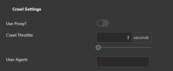
In response to this update, Market Brew has developed its search engine models to be mobile-friendly. One way they have done this is by adjusting the user-agent of their crawls to appear as if they are coming from a mobile device. This allows the crawls to accurately assess the mobile-friendliness of a website.
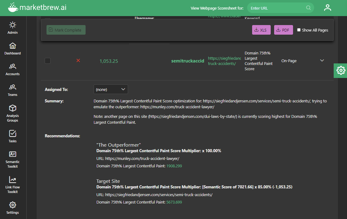
In addition to adjusting the user-agent, Market Brew also includes the Core Web Vitals algorithms in their search engine models. These algorithms measure various aspects of a website's user experience, including loading speed, interactivity, and visual stability. By including these metrics, Market Brew's search engine models can accurately evaluate the mobile-friendliness of a website and prioritize it in search results accordingly.
Overall, the Mobile-Friendly Update had a significant impact on the way that search engines rank websites. By modeling their search engine to prioritize mobile-friendliness, Market Brew has helped businesses adapt to this change and improve their ranking in search results.
By including Core Web Vitals algorithms and implementing responsive design, they have ensured that their search engine models provide a seamless and user-friendly experience for mobile users. Additionally, their range of services and resources have helped businesses optimize their websites for the Mobile-Friendly Update and increase their visibility in search results.
Ready to Take Control of Your SEO?
See how Market Brew's predictive SEO models and expert team can unlock new opportunities for your site. Get tailored insights on how we can help your business rise above the competition.
Schedule a demonstration today via our Menu Button and Contact Form to discover how we engineer SEO success.
You May Also Like:
Guides & Videos
Others
Spotlight Focus Algorithm for SEO to See Entities
History
Google Penguin Update History
Guides & Videos
Impact of Link Velocity on Search Engine Rankings
From ambiguity to actionable insight.
Decode ranking systems, surface leverage points, and deploy with clarity.