
Mobile Optimization For Search Engines: A Complete Guide
Mobile optimization is a crucial aspect of search engine optimization (SEO) in the modern digital landscape.
With the increasing use of smartphones and tablets to access the internet, it is important for businesses and websites to ensure that their content is optimized for mobile devices.
In this article, we will address some common questions about mobile optimization and its relationship to search engines.
We will cover topics such as the importance of mobile optimization, design and layout considerations, indexing and accessibility, and tracking and measurement.
As more and more users turn to their mobile devices to access the internet, it has become increasingly important for businesses and websites to optimize their content for mobile devices.
Mobile optimization, or the process of ensuring that a website is fully functional and user-friendly on mobile devices, is an essential aspect of search engine optimization (SEO). In order to rank highly in search engine results and attract mobile users, it is important to understand the various factors that contribute to a successful mobile optimization strategy.
In this article, we will address some common questions about mobile optimization and its relationship to search engines, and provide insight and best practices for optimizing your website for mobile devices.
So, let's get started!
What Is Mobile Optimization And Why Is It Important For Search Engines?
Mobile optimization is the process of designing and developing a website in a way that makes it easy and convenient for users to access and navigate on a mobile device. This includes optimizing the layout, content, and overall user experience for smaller screens and touch-based interactions.
Mobile optimization is important for search engines because more and more people are using their mobile devices to access the internet and search for information.
In the past, websites were primarily designed for desktop computers and laptops, which had larger screens and were typically used for browsing the internet. However, with the proliferation of smartphones and tablets, more and more people are using these devices to access the internet on the go. As a result, it has become increasingly important for websites to be optimized for mobile devices in order to provide a good user experience and attract a larger audience.
One of the main benefits of mobile optimization is that it helps to improve the user experience on mobile devices. When a website is not optimized for mobile, it can be difficult to navigate and use, which can lead to a higher bounce rate and lower conversion rates. By optimizing the layout, content, and overall design of a website for mobile devices, users are more likely to stay on the site and engage with the content, leading to a better overall experience.
Another benefit of mobile optimization is that it can help to improve the search engine rankings of a website. Search engines, such as Google, use algorithms to determine the relevance and quality of a website's content and rank it accordingly. One of the factors that search engines consider when ranking websites is the mobile-friendliness of a site. If a website is not optimized for mobile, it may be ranked lower in search results, which can lead to fewer visitors and potentially lower revenue. On the other hand, if a website is optimized for mobile, it may be ranked higher in search results, leading to more traffic and potentially higher revenue.
In addition to improving the user experience and search engine rankings, mobile optimization is also important because it allows businesses to reach a larger audience. With more and more people using their mobile devices to access the internet, businesses that are not optimized for mobile may be missing out on potential customers. By optimizing their websites for mobile, businesses can attract and engage a larger audience, leading to increased brand awareness and potentially higher sales.
Overall, mobile optimization is essential for businesses that want to attract and retain a large audience in today's digital world. By optimizing their websites for mobile devices, businesses can improve the user experience, increase search engine rankings, and reach a larger audience, leading to increased brand awareness and potentially higher sales.
How Does The Design And Layout Of A Mobile Website Affect Its Ranking In Search Engines?
The design and layout of a mobile website can significantly impact its ranking in search engines.
There are several factors that search engines consider when ranking a mobile website, and the design and layout play a crucial role in these rankings.
First and foremost, the user experience of a mobile website is an essential factor for search engines. A mobile website that is easy to navigate and provides a smooth user experience is more likely to rank higher in search results. This includes having a clear hierarchy of information, easy-to-use menu options, and responsive design that adjusts to the user's device and screen size.
Another factor that affects a mobile website's ranking is the loading speed. Search engines prioritize websites that load quickly, especially on mobile devices, as this is essential for a good user experience. A slow-loading mobile website is likely to rank lower in search results, as it will be perceived as less valuable to users.
Mobile website design and layout also play a role in the content that is presented to users. A mobile website should have a clear and concise layout that makes it easy for users to find the information they need. This includes using headlines and subheadings to break up the content and making use of bullet points and lists to organize information. The use of images and videos can also be useful in engaging users and providing additional information, but they should be used sparingly to avoid slowing down the website.
In addition to the above factors, mobile website design and layout can also impact search engine rankings through the use of keywords and meta tags. Keywords are words or phrases that are used to describe the content of a website and are used by search engines to understand what a website is about. The use of relevant keywords in the design and layout of a mobile website can help search engines understand the content and improve the website's ranking.
Meta tags are pieces of information that are included in the HTML code of a website and provide additional information about the content of a website. These tags can include descriptions, keywords, and titles that are used by search engines to understand the content of a website. The use of relevant meta tags in the design and layout of a mobile website can help search engines understand the content and improve the website's ranking.
In conclusion, the design and layout of a mobile website can significantly impact its ranking in search engines. A mobile website that is easy to navigate, has a smooth user experience, loads quickly, and uses relevant keywords and meta tags is more likely to rank higher in search results. Ensuring that the design and layout of a mobile website meet these criteria is essential for improving its ranking in search engines.
How Can I Ensure That My Mobile Website Is Properly Indexed By Search Engines?
Search engines see mobile websites different than a desktop site, so it is important to understand some critical things about mobile websites and indexing.
There are several steps you can take to ensure that your mobile website is properly indexed by search engines:
- Start with a well-designed and mobile-friendly website. Google prefers websites that are easy to navigate and have a good user experience, so it’s important to ensure that your website is mobile-friendly and has a responsive design that adjusts to different screen sizes.
- Use relevant and unique title tags and meta descriptions. Title tags and meta descriptions are the snippets of text that appear in search results, and they help search engines understand what your website is about. Make sure to include relevant keywords in your title tags and meta descriptions, and try to make them unique to your website to stand out in search results.
- Use header tags appropriately. Header tags (H1, H2, etc.) help search engines understand the hierarchy of your content and can also be used as a ranking factor. Use header tags appropriately and include relevant keywords in them to help search engines understand the relevance of your content.
- Optimize your website’s loading speed. Google ranks websites higher in search results that have fast loading times, so it’s important to optimize your website’s loading speed. You can use tools like Google PageSpeed Insights to analyze your website’s loading speed and identify areas for improvement.
- Use alt tags on images. Alt tags are text descriptions that are used to describe the content of an image in case it doesn’t load properly. They help search engines understand what the image is about, and they can also be used as a ranking factor. Make sure to include relevant keywords in your alt tags to help search engines understand the relevance of your images.
- Use a mobile sitemap. A mobile sitemap is a list of all the pages on your website that are specifically designed for mobile devices. Submitting a mobile sitemap to search engines helps them understand which pages on your website are mobile-friendly, and it can also help them crawl and index your mobile website more efficiently.
- Use Google Search Console. Google Search Console is a free tool that allows you to see how your website is performing in Google search results and identify any issues that may be preventing it from being properly indexed. It also allows you to submit your sitemap and individual URLs to Google for crawling and indexing.
- Use mobile-specific URLs. If you have a separate mobile website, it’s important to use mobile-specific URLs to ensure that search engines understand which version of your website is intended for mobile devices. You can use the rel=“alternate” and rel=“canonical” tags to help search engines understand which version of your website is the mobile version.
- Use social media to promote your mobile website. Social media platforms like Facebook and Twitter can be a great way to promote your mobile website and drive traffic to it. Make sure to include links to your mobile website in your social media profiles and use relevant hashtags to increase visibility.
- Monitor your website’s performance. It’s important to regularly monitor your website’s performance to ensure that it’s being properly indexed by search engines and performing well in search results. Tools like Google Analytics can help you track your website’s traffic and identify any issues that may be preventing it from being properly indexed.
By following these steps, you can help ensure that your mobile website is properly indexed by search engines and has a good chance of ranking well in search results. It’s also important to keep in mind that SEO is an ongoing process, and it’s important to regularly optimize your mobile website to stay up-to-date with the latest best practices and algorithms. This may include updating your website’s content and design, as well as monitoring and analyzing your website’s performance to identify areas for improvement.
By staying on top of your mobile website’s SEO, you can increase its visibility and drive more traffic to your website, which can help increase your online presence and reach your target audience.
How Do I Make Sure That My Mobile Website Loads Quickly For Users?
It is critical to make sure your mobile website loads quickly for users, as Google has explicitly said it ranks these sites higher.
There are several steps you can take to ensure that your mobile website loads quickly for users:
- Optimize images: Large images can significantly slow down the loading time of your website. To optimize your images, you can resize them to a smaller size and compress them using tools like TinyPNG or Kraken.io.
- Minimize the use of JavaScript and CSS: Too much JavaScript and CSS can slow down the loading time of your website. To minimize their use, you can combine multiple JavaScript and CSS files into one file, and minify them using tools like MinifyCode or CSS Compressor.
- Enable caching: Caching allows your website to store certain elements, such as images and CSS files, in the user's browser so that they do not have to be downloaded every time the user visits the website. You can enable caching by adding a caching plugin or using a content delivery network (CDN).
- Use a lightweight theme: A lightweight theme will load faster than a heavier theme with more features. Choose a theme that has only the necessary features and is optimized for performance.
- Use lazy loading: Lazy loading allows images and other elements to load only when they are needed, rather than all at once when the page loads. This can significantly improve the loading time of your website.
- Optimize your server: A slow server can significantly impact the loading time of your website. You can optimize your server by using a faster hosting provider, optimizing your database, and enabling gzip compression.
- Optimize your website for mobile: Mobile devices have limited resources compared to desktop computers, so it is important to optimize your website for mobile. This includes optimizing images, minimizing the use of JavaScript and CSS, and using a lightweight theme.
- Use a mobile-specific version of your website: A separate mobile version of your website will load faster than a desktop version that has been scaled down for mobile. You can create a mobile version of your website using responsive design or a separate mobile subdomain.
- Monitor your website's performance: Use tools like Google PageSpeed Insights and GTmetrix to monitor the performance of your website and identify areas that need improvement.
By following these steps, you can ensure that your mobile website loads quickly for users and provides a positive user experience. It is important to regularly monitor and optimize your website to ensure that it continues to perform at its best.
How Do I Optimize My Mobile Website For Local Search?
As more and more consumers turn to their smartphones for local search, it is essential for businesses to optimize their mobile websites for local search.
Local search optimization refers to the process of improving a website's visibility in search engine results for a specific geographic area.
Here are some tips on how to optimize your mobile website for local search:
- Claim and optimize your Google My Business listing: Google My Business is a free tool that allows businesses to manage their online presence across Google, including Google Maps. By claiming and optimizing your Google My Business listing, you can ensure that your business appears in local search results and that potential customers can find accurate information about your location, hours, and contact information.
- Include location-specific keywords in your website's content: When it comes to local search, it is important to include location-specific keywords in your website's content. This includes the name of your city, state, and neighborhood, as well as any relevant landmarks or points of interest. By including these keywords, you can help search engines understand the relevance of your website to a specific geographic area and improve your local search ranking.
- Use schema markup: Schema markup is a type of code that you can add to your website's HTML to help search engines understand the meaning of your content. By adding schema markup for your business location, you can help search engines understand the relevance of your website to a specific geographic area and improve your local search ranking.
- Optimize your website's loading speed: Mobile users expect websites to load quickly, and slow loading times can lead to higher bounce rates and lower search rankings. To optimize your website's loading speed, you can minimize the use of large images and videos, enable caching, and use a content delivery network (CDN).
- Make sure your website is mobile-friendly: With the increasing use of smartphones for local search, it is essential to ensure that your website is mobile-friendly. This means that your website should be easy to read and navigate on a small screen, with buttons and links that are easy to tap. You can use Google's mobile-friendly test tool to check if your website is mobile-friendly and make any necessary changes.
- Use local citations: Local citations refer to mentions of your business's name, address, and phone number on other websites. Local citations can help improve your local search ranking by providing additional signals to search engines that your business is relevant to a specific geographic area. You can improve your local citations by listing your business on local directories and online review sites.
- Encourage online reviews: Online reviews can help improve your local search ranking by providing additional signals to search engines that your business is relevant to a specific geographic area. Encourage your customers to leave reviews on Google, Yelp, and other review sites, and make sure to respond to any negative reviews in a timely and professional manner.
In conclusion, optimizing your mobile website for local search is essential for businesses that want to reach potential customers in a specific geographic area.
By following the tips outlined above, you can improve your website's visibility in local search results and attract more customers to your business.
How Do I Make Sure That My Mobile Website Is Accessible To Users With Disabilities?
Ensuring that your mobile website is accessible to users with disabilities is an important aspect of creating a user-friendly and inclusive website.
There are several steps that you can take to ensure that your mobile website is accessible to all users, regardless of their abilities or disabilities:
- Use proper formatting and layout: Using proper formatting and layout can help make your website more accessible to users with disabilities. This includes using clear headings and subheadings, using bullet points to organize content, and breaking up text into shorter paragraphs.
- Use alt text for images: Alt text is a description of an image that can be read by screen readers, which are used by people with vision impairments. By adding alt text to your images, you can ensure that users with vision impairments can still understand the content of your website.
- Provide transcripts for audio and video content: If you have audio or video content on your website, it’s important to provide transcripts so that users with hearing impairments can still access the content. You can also consider adding closed captions to your video content to make it more accessible to users with hearing impairments.
- Use descriptive link text: Link text should be descriptive and clearly explain what the link will take the user to. Avoid using vague or generic link text, such as “click here” or “read more.”
- Use larger fonts: Users with vision impairments may have difficulty reading small font sizes. To make your website more accessible, consider using larger font sizes and making sure that your font is easy to read.
- Use high contrast colors: Users with vision impairments may have difficulty reading text on a low contrast background. To make your website more accessible, consider using high contrast colors, such as black text on a white background.
- Make sure your website is mobile-friendly: With the increasing use of smartphones and tablets to access the internet, it’s important to make sure that your website is mobile-friendly. This means that your website should be easy to navigate and read on a smaller screen, and it should also be responsive to different screen sizes.
- Use ARIA landmarks: ARIA (Accessible Rich Internet Applications) landmarks are tags that can be added to your website’s HTML code to help screen readers navigate the website. These landmarks can help users with disabilities understand the structure and layout of your website.
- Test your website for accessibility: To ensure that your website is truly accessible to users with disabilities, it’s important to test it. There are several tools available that can help you test your website for accessibility, such as the WAVE web accessibility evaluation tool and the Lighthouse accessibility audit tool.
By following these steps, you can ensure that your mobile website is accessible to users with disabilities. It’s important to remember that accessibility is not just a one-time effort, but rather a continuous process that requires ongoing attention and updates.
By continuously testing and improving your website’s accessibility, you can create a user-friendly and inclusive experience for all of your users.
How Do I Optimize My Mobile Website For Voice Search?
Voice search is becoming increasingly popular as more and more people are using virtual assistants like Google Assistant and Amazon Alexa. This trend presents an opportunity for businesses to optimize their mobile websites for voice search in order to reach a wider audience and improve their search engine rankings.
Here are some tips for optimizing your mobile website for voice search:
- Use long-tail keywords: Voice searches tend to be longer and more conversational than typed searches, so it’s important to use long-tail keywords that reflect this. Instead of just using single keywords like “pizza,” try using phrases like “where can I find the best pizza near me” or “what are the top-rated pizza places in my area.”
- Use structured data: Structured data, also known as schema markup, is a way to provide information about your website to search engines in a standardized format. By using structured data, you can help search engines understand the content and purpose of your website, which can improve your search engine rankings and increase the chances that your website will appear in voice search results.
- Optimize for featured snippets: Featured snippets are short answers to a specific question that appear at the top of search engine results. These are often used by voice assistants to provide a quick answer to a question, so it’s important to optimize your website for featured snippets in order to increase the chances that your website will be used as a source for voice search results.
- Use natural language: When optimizing for voice search, it’s important to use natural language that reflects the way people speak. This includes using common phrases and questions, as well as avoiding jargon and technical language.
- Use headings and subheadings: Headings and subheadings help to break up your content and make it easier for people to scan and understand. They also help search engines understand the structure and hierarchy of your content, which can improve your search engine rankings.
- Make sure your website is mobile-friendly: With the increasing popularity of voice search, it’s important to make sure your website is mobile-friendly. This includes ensuring that your website loads quickly, is easy to navigate, and is optimized for smaller screens.
- Use local SEO: Many voice searches are related to finding local businesses or services, so it’s important to optimize your website for local SEO. This includes using local keywords, claiming your Google My Business listing, and getting listed in local directories.
- Use alt tags: Alt tags are descriptions of images that appear when the image cannot be displayed. These tags are important for voice search because virtual assistants often use them to provide more information about the content of an image.
- Use social media: Social media can be a powerful tool for reaching a wider audience and improving your search engine rankings. By using social media to promote your website and share your content, you can increase the chances that your website will be found through voice search.
In conclusion, optimizing your mobile website for voice search is an important step for businesses looking to reach a wider audience and improve their search engine rankings. By using long-tail keywords, structured data, natural language, and other techniques, you can improve the chances that your website will be found through voice search and increase your visibility online.
How Do I Optimize My Mobile Website For Featured Snippets And Rich Results?
Optimizing a mobile website for featured snippets and rich results can greatly improve its visibility and usability for users, as well as its search engine rankings.
Here are some key strategies and best practices for optimizing a mobile website for featured snippets and rich results:
- Understand what featured snippets and rich results are: Featured snippets are short, summary-like answers to a user's search query that appear at the top of the search results page. They are designed to provide users with quick and easy access to the information they are seeking. Rich results, on the other hand, are more interactive and visually appealing search results that can include elements such as images, videos, and ratings. Both featured snippets and rich results are designed to enhance the user experience and improve the visibility of a website in search results.
- Use structured data: Structured data is a way of organizing and formatting information on a website in a way that makes it easy for search engines to understand and interpret. By using structured data, you can help search engines identify the most relevant information on your website and display it in featured snippets and rich results. Some common types of structured data that can be used for featured snippets and rich results include schema.org, JSON-LD, and Microdata.
- Use clear and concise language: When creating content for your mobile website, it is important to use clear and concise language that is easy to understand and scan. This will help search engines easily identify the most relevant and useful information on your website, and increase the chances of your content being featured in a snippet or rich result.
- Use header tags appropriately: Header tags, such as H1, H2, and H3 tags, are used to structure and organize content on a website. They help search engines understand the hierarchy and importance of different pieces of content. By using header tags appropriately, you can help search engines identify the most important information on your website and increase the chances of it being featured in a snippet or rich result.
- Include relevant keywords: Keywords are the words and phrases that people use when searching for information online. By including relevant keywords in your content, you can help search engines understand what your website is about and increase the chances of it being featured in a snippet or rich result. However, it is important to avoid keyword stuffing, as this can negatively impact your website's search rankings.
- Use high-quality images and videos: Including high-quality images and videos on your website can make it more visually appealing and engaging for users. They can also help improve your website's visibility in search results, as search engines often display rich results that include images and videos. When using images and videos, be sure to include relevant alt tags and captions to help search engines understand their context.
- Optimize for mobile: With the increasing number of people accessing the internet via mobile devices, it is important to ensure that your mobile website is optimized for these users. This includes using responsive design, which allows your website to adapt to different screen sizes and resolutions, and reducing the use of pop-ups and interstitials, which can be frustrating for mobile users.
- Monitor and track your results: To ensure that your mobile website is optimized for featured snippets and rich results, it is important to monitor and track your results. This can be done using tools such as Google Search Console and Google Analytics, which provide valuable insights into your website's performance and visibility in search results. By regularly reviewing and analyzing these results, you can identify areas for improvement and optimize your mobile website accordingly.
In conclusion, optimizing a mobile website for featured snippets and rich results requires a combination of technical optimization, high-quality content, and a focus on the user experience.
By using structured data, clear and concise language, appropriate header tags, relevant keywords, and engaging images and videos, you can help search engines understand the value and relevance of your website and improve its chances of being featured in a snippet or rich result.
Additionally, optimizing for mobile and monitoring and tracking your results can help ensure that your website is optimized for featured snippets and rich results and performing at its best.
By following these strategies, you can improve the visibility and usability of your mobile website for both users and search engines.
How Do I Track And Measure The Success Of My Mobile Optimization Efforts?
Tracking and measuring the success of mobile optimization efforts is crucial for any business that wants to ensure its website is fully optimized for mobile devices.
There are several key metrics that businesses can use to gauge the effectiveness of their mobile optimization efforts and make informed decisions about how to improve the user experience for their mobile visitors.
One of the most important metrics to track is the percentage of traffic coming from mobile devices. This can be easily done using Google Analytics or a similar tool, and it will give you an idea of how many of your visitors are accessing your website from a mobile device. You can then compare this to your desktop traffic to see if your mobile optimization efforts are paying off.
Another important metric to track is the bounce rate of mobile visitors. This is the percentage of visitors who leave your website after only viewing one page. If your bounce rate is high, it could be a sign that your website is not fully optimized for mobile devices and that visitors are having a poor user experience. By tracking your bounce rate, you can identify any issues with your mobile website and take steps to improve it.
In addition to tracking traffic and bounce rates, it's also important to track the performance of your mobile website. This includes metrics like page load times, which can have a big impact on the user experience. If your mobile website is slow to load, visitors are likely to become frustrated and leave your site. By monitoring your page load times, you can identify any issues and take steps to improve them.
Another key metric to track is the number of conversions you are seeing from mobile visitors. This could include things like online purchases, form submissions, or other actions that you want visitors to take on your website. By tracking your conversion rates, you can see if your mobile optimization efforts are leading to increased conversions and identify any areas where you might be able to improve.
In addition to these core metrics, there are also a number of other metrics that you can track to measure the success of your mobile optimization efforts. These might include things like the average time visitors spend on your mobile website, the number of pages they view, and the number of referrals or social shares your website receives. All of these metrics can help you understand the user experience of your mobile visitors and identify areas for improvement.
To track and measure the success of your mobile optimization efforts, it's important to use a combination of tools and techniques. This might include things like Google Analytics, heat mapping software, and user testing. By using a variety of approaches, you can get a comprehensive understanding of how your mobile website is performing and identify any areas for improvement.
Overall, tracking and measuring the success of your mobile optimization efforts is crucial for any business that wants to ensure its website is fully optimized for mobile devices. By monitoring key metrics like traffic, bounce rates, performance, and conversions, you can identify any issues with your mobile website and take steps to improve the user experience for your mobile visitors.
How Do I Stay Up-to-date With The Latest Mobile Optimization Best Practices And Guidelines?
Staying up-to-date with the latest mobile optimization best practices and guidelines is essential for any business that wants to succeed in today's digital landscape. With the rapid pace of change in the tech industry, it's important to continuously educate oneself on the latest trends and techniques in order to ensure that your website and mobile apps are optimized for the best possible user experience.
Here are a few tips for staying up-to-date with the latest mobile optimization best practices and guidelines:
- Follow industry blogs and news outlets: One of the easiest ways to stay informed about the latest mobile optimization best practices and guidelines is to follow industry blogs and news outlets that cover the topic. There are a number of great resources out there, such as Search Engine Land, MOZ, and Mobile Marketing Magazine, that provide regular updates on the latest trends and techniques in mobile optimization. By subscribing to their newsletters or following them on social media, you can stay in the loop and be the first to know about any new developments in the field.
- Attend industry conferences and events: Another great way to stay up-to-date with the latest mobile optimization best practices and guidelines is to attend industry conferences and events. These events bring together experts and professionals from across the industry and provide a wealth of information and insights on the latest trends and techniques in mobile optimization. Many conferences also offer workshops and training sessions where you can learn hands-on skills and techniques that you can apply to your own business.
- Take online courses and earn certifications: There are a number of online courses and certifications available that can help you stay up-to-date with the latest mobile optimization best practices and guidelines. For example, Google offers a number of courses and certifications through their Google Partners program, including the Mobile Sites certification which covers the latest techniques for optimizing websites for mobile devices. Other popular certification programs include the Mobile Marketing Association's Mobile Marketing Professional (MMP) and the Mobile Marketing Association's Mobile Advertising Professional (MAP) certifications.
- Join online communities and forums: There are a number of online communities and forums dedicated to mobile optimization where you can connect with other professionals, ask questions, and share insights and knowledge. Some popular forums include the Mobile Marketing Forum and the Mobile Marketing Association's Mobile Marketing Professionals LinkedIn group. By participating in these communities, you can stay up-to-date with the latest trends and techniques, as well as connect with other professionals in the industry.
- Stay updated on the latest mobile technology and devices: In order to optimize your website and mobile apps for the best possible user experience, it's important to stay up-to-date on the latest mobile technology and devices. This includes staying informed about new devices and operating systems as they are released, as well as keeping an eye on emerging technologies such as virtual and augmented reality. By understanding the capabilities of these technologies, you can ensure that your website and mobile apps are optimized to take advantage of them.
By following these tips, you can stay up-to-date with the latest mobile optimization best practices and guidelines and ensure that your website and mobile apps are optimized for the best possible user experience.
By staying informed and proactive, you can stay ahead of the curve and ensure that your business stays competitive in today's digital landscape.
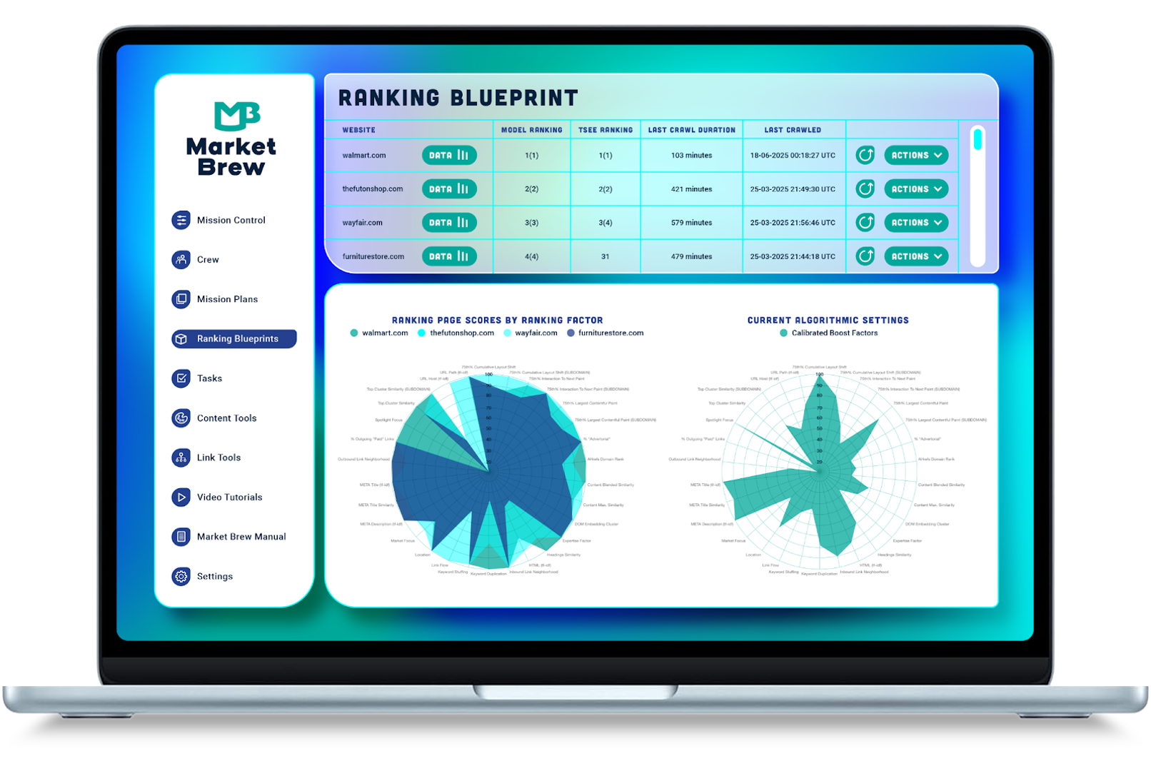
Mobile Optimization Using Market Brew's Search Engine Model
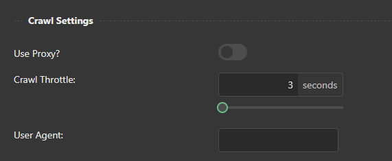
Market Brew's search engine model allows for the testing of mobile-first crawling by changing the user-agent to a mobile crawler and observing how the search engine sees the content.
In addition to testing mobile-first crawling, the Market Brew search engine model can also be used to test other aspects of a website's performance, including the speed and usability of the site on different devices and browsers. This can help businesses identify areas for improvement and make necessary changes to ensure that their website is providing a high-quality user experience for all users.
This process can be done through the following steps:
- Identify the content to be tested: The first step in testing mobile-first crawling is to identify the content that needs to be tested. This can be a specific page or a group of pages on the website.
- Set up the mobile crawler: Once the content has been identified, the next step is to set up the mobile crawler. This can be done through the Market Brew search engine model by changing the user-agent to a mobile crawler. Make sure you do this for each site that appears in your search engine model.
- Crawl the content: After the mobile crawler has been set up, the content can be crawled. This involves the mobile crawler accessing and scanning the content on the website to determine its relevance and quality.
- Analyze the results: Once the content has been crawled, the results can be analyzed to see how the search engine sees the content. This can include reviewing the ranking of the content in search results, the amount of traffic it receives, and the overall user experience.
- Make necessary adjustments: If the results of the mobile-first crawling test are not satisfactory, adjustments can be made to improve the content and its performance on mobile devices. This may include optimizing images, reducing page load times, and improving the overall user experience.
By using Market Brew's search engine model to test mobile-first crawling, businesses can ensure that their content is optimized for mobile devices and is easily accessible to users. This can help to improve the ranking of the content in search results and increase the amount of traffic it receives, resulting in increased revenue and success for the business.
Overall, the ability to test mobile-first crawling through the Market Brew's AI SEO software is an essential tool for businesses looking to optimize their content for mobile devices and improve their performance in search results.
By using their search engine models to analyze and make necessary adjustments, businesses can increase the accessibility and usability of their website on mobile devices, leading to increased traffic, revenue, and success.
Ready to Take Control of Your SEO?
See how Market Brew's predictive SEO models and expert team can unlock new opportunities for your site. Get tailored insights on how we can help your business rise above the competition.
Schedule a demonstration today via our Menu Button and Contact Form to discover how we engineer SEO success.
You May Also Like:
Guides & Videos
Genetic Programming for SEO Content
Guides & Videos
Link Algorithms and Their Impact on SEO
Guides & Videos
Video SEO: A Comprehensive Guide
From ambiguity to actionable insight.
Decode ranking systems, surface leverage points, and deploy with clarity.